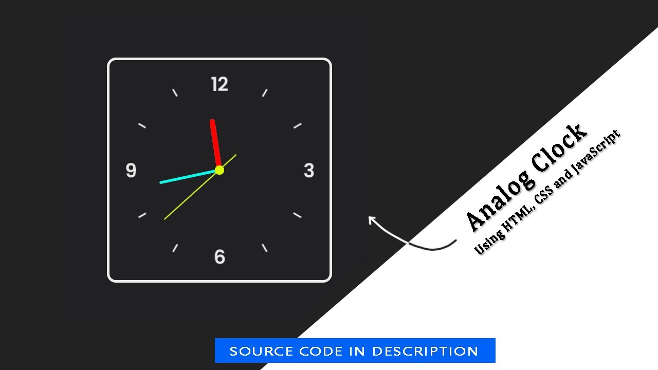
We are going to build a real-time analog clock using HTML, CSS, and JavaScript.
1. Create an HTML file and include a basic structure with a head and body tag. You can use the following code as a starting point and Add the CSS and JavaScript files to your HTML document.
<!DOCTYPE html>
<html lang="en">
<head>
    <meta charset="UTF-8">
    <meta http-equiv="X-UA-Compatible" content="IE=edge">
    <meta name="viewport" content="width=device-width, initial-scale=1.0">
    <title>Create an Analog Clock using HTML, CSS and JavaScript</title>
    <link rel="stylesheet" href="style.css">
</head>
<body>

</body>
</html>
2. Inside the body tag, create a div element with a class of "container".
<div class="container">
  <div class="clock">
     <div class="hours"></div>
     <div class="minuts"></div>
     <div class="seconds"></div>
  </div>
</div>
3. Inside the body tag, create a script tag.
        const hours = document.querySelector(".hours");
        const minuts = document.querySelector(".minuts");
        const seconds = document.querySelector(".seconds");

        setInterval(() => {

            let date = new Date();
            h = date.getHours() * 30;
            m = date.getMinutes() * 6;
            s = date.getSeconds() * 6;

            hours.style.transform = `rotate(${(h) + (m / 12)}deg)`;
            minuts.style.transform = `rotate(${m}deg)`;
            seconds.style.transform = `rotate(${s}deg)`;
        });
4. Create a CSS file and style your Analog Clock to make it look nice. You can use the following code as a starting point:
*{
    box-sizing: border-box;
}
body{
    background: #000;
    margin: 0;
    padding: 0;
    display: flex;
    width: 100%;
    height: 100vh;
    align-items: center;
    justify-content: center;
}
.container{
    width: 350px;
    height: 350px;
}
.clock{
    width: 350px;
    height: 350px;
    display: flex;
    justify-content: center;
    align-items: center;
    background: url(clock.png);
    background-size: cover;
    border: solid 4px #787878;
    border-radius: 4%;
    box-shadow:  inset 6px -15px -15px #fffd,
    6px 15px 15px #000d, inset 6px 15px 15px #000d;
}

.clock::before{
    content: "";
    position: absolute;
    width: 15px;
    height: 15px;
    background: #d9ff00;
    border-radius: 50%;
    z-index: 999;
}

.hours{
    width: 160px;
    height: 160px;
}
.minuts{
    width: 190px;
    height: 190px;
}
.seconds{
    width: 230px;
    height: 230px;
}
.hours, .minuts, .seconds{
    display: flex;
    justify-content: center;
    position: absolute;
    border-radius: 50%;
}
.hours::before{
    content: "";
    position: absolute;
    width: 8px;
    height: 80px;
    background: #f00;
    z-index: 90;
    border-radius: 6px 6px 0 0;
}
.minuts::before{
    content: "";
    position: absolute;
    width: 4px;
    height: 90px;
    background: #00ffee;
    z-index: 91;
    border-radius: 6px 6px 0 0;
}
.seconds::before{
    content: "";
    position: absolute;
    width: 2px;
    height: 150px;
    background: #d9ff00;
    z-index: 93;
    border-radius: 6px 6px 0 0;
}
5. Save the file and open it in a web browser to see your Responsive Slider.
Html Code
<!DOCTYPE html>
<html lang="en">

<head>
    <meta charset="UTF-8">
    <meta http-equiv="X-UA-Compatible" content="IE=edge">
    <meta name="viewport" content="width=device-width, initial-scale=1.0">
    <title>Create an Analog Clock using HTML, CSS and JavaScript</title>
    <link rel="stylesheet" href="style.css">
</head>

<body>
    <div class="container">
        <div class="clock">
            <div class="hours"></div>
            <div class="minuts"></div>
            <div class="seconds"></div>
        </div>
    </div>
</body>

</html>
Css Code
*{
    box-sizing: border-box;
}
body{
    background: #000;
    margin: 0;
    padding: 0;
    display: flex;
    width: 100%;
    height: 100vh;
    align-items: center;
    justify-content: center;
}
.container{
    width: 350px;
    height: 350px;
}
.clock{
    width: 350px;
    height: 350px;
    display: flex;
    justify-content: center;
    align-items: center;
    background: url("https://blogger.googleusercontent.com/img/b/R29vZ2xl/AVvXsEhbkERYfYbBTmxnj7jJRNqgqUFc5IfvjDzsOTSc6tirA6WeeT3_vKDfrXOaDUbYhksK_rbRAIZqBchmtTR4tKVP67ioY4TSS4l-zL2ZFpqFFjWRr0YgPqM6jEvE6VQjL_wf6rnvcFDtG-PtG_iZNNFJ7xFLz46nSywMHlmfT46InOpx6bOM8WlfLz77nA/s320/clock.png");
    background-size: cover;
    border: solid 4px #787878;
    border-radius: 4%;
    box-shadow:  inset 6px -15px -15px #fffd,
    6px 15px 15px #000d, inset 6px 15px 15px #000d;
}

.clock::before{
    content: "";
    position: absolute;
    width: 15px;
    height: 15px;
    background: #d9ff00;
    border-radius: 50%;
    z-index: 999;
}

.hours{
    width: 160px;
    height: 160px;
}
.minuts{
    width: 190px;
    height: 190px;
}
.seconds{
    width: 230px;
    height: 230px;
}
.hours, .minuts, .seconds{
    display: flex;
    justify-content: center;
    position: absolute;
    border-radius: 50%;
}
.hours::before{
    content: "";
    position: absolute;
    width: 8px;
    height: 80px;
    background: #f00;
    z-index: 90;
    border-radius: 6px 6px 0 0;
}
.minuts::before{
    content: "";
    position: absolute;
    width: 4px;
    height: 90px;
    background: #00ffee;
    z-index: 91;
    border-radius: 6px 6px 0 0;
}
.seconds::before{
    content: "";
    position: absolute;
    width: 2px;
    height: 150px;
    background: #d9ff00;
    z-index: 93;
    border-radius: 6px 6px 0 0;
}
Js Code
        const hours = document.querySelector(".hours");
        const minuts = document.querySelector(".minuts");
        const seconds = document.querySelector(".seconds");

        setInterval(() => {

            let date = new Date();
            h = date.getHours() * 30;
            m = date.getMinutes() * 6;
            s = date.getSeconds() * 6;

            hours.style.transform = `rotate(${(h) + (m / 12)}deg)`;
            minuts.style.transform = `rotate(${m}deg)`;
            seconds.style.transform = `rotate(${s}deg)`;
        });