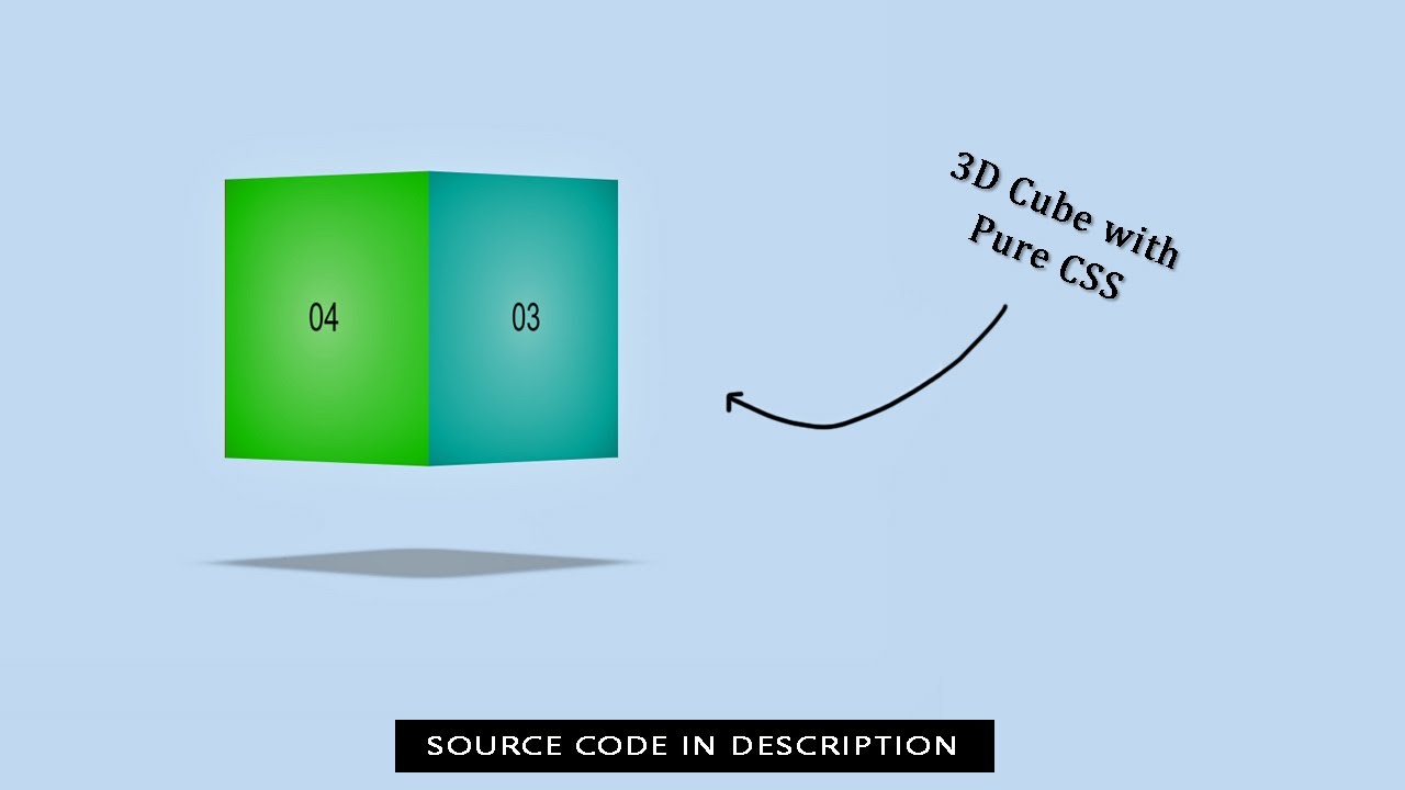
3D cube effect can be achieved easily with CSS 3D Transform by creating div for each side of the cube. Then use rotateX, rotateY and rotateZ to put them into their places. Transform-origin is also needed to move the rotation fulcrum
Here's an example of a Social Media Icon created using pure CSS.
1. Create an HTML file and include a basic structure with a head and body tag. You can use the following code as a starting point and Add the CSS files to your HTML document.
<!DOCTYPE html>
<html lang="en">
<head>
    <meta charset="UTF-8">
    <meta http-equiv="X-UA-Compatible" content="IE=edge">
    <meta name="viewport" content="width=device-width, initial-scale=1.0">
    <title>Creating 3D Cube with Pure CSS</title>
    <link rel="stylesheet" href="style.css">
</head>
<body>
</body>
</html>
2. Inside the body tag, create a div element with a class of "container".
<div class="container">
   <div class="box">
      <div class="item">01</div>
      <div class="item">02</div>
      <div class="item">03</div>
      <div class="item">04</div>
      <div class="shadow"></div>
   </div>
</div>
3. Create a CSS file and style your 3D Cube to make it look nice. You can use the following code as a starting point:
body {
    font-family: sans-serif;
    background: #d3eaff;
    display: flex;
    align-items: center;
    justify-content: center;
    height: 92vh;
}

.container {
    perspective: 3000px;
}

.box {
    display: block;
    width: 250px;
    height: 250px;
    margin: 70px auto;
    transform-style: preserve-3d;
    transition: transform 350ms;
    animation: spin 10s infinite linear;
}

@keyframes spin {
    0% {
        transform: rotateY(0deg) translateZ(-120px);
    }

    100% {
        transform: rotateY(360deg) translateZ(-120px);
    }
}

.item,
.shadow {
    display: block;
    width: 250px;
    height: 250px;
    position: absolute;
}

.item {
    display: flex;
    align-items: center;
    justify-content: center;
    background: radial-gradient(#fff8, #0000);
    font-size: 34px;
}

.item:nth-child(1) {
    transform: rotateY(90deg) translate3D(-125px, 0, 125px);
    background-color: #ff180c;
}

.item:nth-child(2) {
    transform: translate3D(0, 0, 250px);
    animation-delay: 1s;
    background-color: #ffab10;
}

.item:nth-child(4) {
    transform: rotateY(180deg) translate3D(0, 0, 0);
    animation-delay: 1s;
    background-color: #1fbf0d;
}

.item:nth-child(3) {
    transform: rotateY(270deg) translate3D(125px, 0px, 125px);
    background-color: #00a096;
}

.shadow {
    background-color: #999999;
    box-shadow: 0 0 30px rgba(0, 0, 0, 1);
    opacity: 0.5;
    transform: rotateX(90deg) translate3D(0, 125px, -220px);
    filter: blur(10px);
    animation: none;
}
4. Save the file and open it in a web browser to see your Social Media Icon.
Html Code
<div class="container">
   <div class="box">
      <div class="item">01</div>
      <div class="item">02</div>
      <div class="item">03</div>
      <div class="item">04</div>
      <div class="shadow"></div>
   </div>
</div>
Css Code
body {
    font-family: sans-serif;
    background: #d3eaff;
    display: flex;
    align-items: center;
    justify-content: center;
    height: 92vh;
}

.container {
    perspective: 3000px;
}

.box {
    display: block;
    width: 250px;
    height: 250px;
    margin: 70px auto;
    transform-style: preserve-3d;
    transition: transform 350ms;
    animation: spin 10s infinite linear;
}

@keyframes spin {
    0% {
        transform: rotateY(0deg) translateZ(-120px);
    }

    100% {
        transform: rotateY(360deg) translateZ(-120px);
    }
}

.item,
.shadow {
    display: block;
    width: 250px;
    height: 250px;
    position: absolute;
}

.item {
    display: flex;
    align-items: center;
    justify-content: center;
    background: radial-gradient(#fff8, #0000);
    font-size: 34px;
}

.item:nth-child(1) {
    transform: rotateY(90deg) translate3D(-125px, 0, 125px);
    background-color: #ff180c;
}

.item:nth-child(2) {
    transform: translate3D(0, 0, 250px);
    animation-delay: 1s;
    background-color: #ffab10;
}

.item:nth-child(4) {
    transform: rotateY(180deg) translate3D(0, 0, 0);
    animation-delay: 1s;
    background-color: #1fbf0d;
}

.item:nth-child(3) {
    transform: rotateY(270deg) translate3D(125px, 0px, 125px);
    background-color: #00a096;
}

.shadow {
    background-color: #999999;
    box-shadow: 0 0 30px rgba(0, 0, 0, 1);
    opacity: 0.5;
    transform: rotateX(90deg) translate3D(0, 125px, -220px);
    filter: blur(10px);
    animation: none;
}