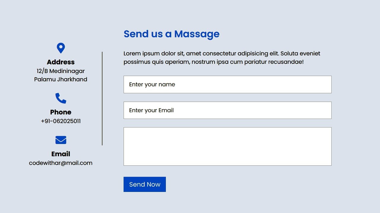
Here's an example of a Responsive Contact form created using pure CSS.
1. Create an HTML file and include a basic structure with a head and body tag. You can use the following code as a starting point and Add the CSS files to your HTML document.
<!DOCTYPE html>
<html lang="en">
<head>
    <meta charset="UTF-8">
    <meta http-equiv="X-UA-Compatible" content="IE=edge">
    <meta name="viewport" content="width=device-width, initial-scale=1.0">
    <title>Responsive Contact us form using Html and CSS</title>
    <link rel="stylesheet" href="style.css">
    <link rel="stylesheet" href="https://cdnjs.cloudflare.com/ajax/libs/font-awesome/5.15.1/css/all.min.css">
</head>
<body>
</body>
</html>
2. Inside the body tag, create a div element with a class of "container".
    <div class="container">
        <div class="left-side">
            <div class="address details">
                <i class="fas fa-map-marker-alt"></i>
                <h3>Address</h3>
                <p>12/B Medininagar Palamu Jharkhand</p>
            </div>
            <div class="phone details">
                <i class="fas fa-phone-alt"></i>
                <h3>Phone</h3>
                <p>+91-062025011</p>
            </div>
            <div class="email details">
                <i class="fas fa-envelope"></i>
                <h3>Email</h3>
                <p>codewithar@mail.com</p>
            </div>
        </div>
        <div class="right-side">
            <h2 class="title">Send us a Massage</h2>
            <p>Lorem ipsum dolor sit, amet consectetur adipisicing elit. Soluta eveniet possimus quis aperiam, nostrum ipsa cum pariatur recusandae!</p>
            <form action="#" method="get">
                <input type="text" class="input-box" placeholder="Enter your name">
                <input type="text" class="input-box" placeholder="Enter your Email">
                <textarea class="input-box massage-box" name="" id="" cols="30" rows="10" placeholder="Enter your Massage"> </textarea>
                <input class="button" type="button" value="Send Now">
            </form>
        </div>
    </div>
3. Create a CSS file and style your Contact form to make it look nice. You can use the following code as a starting point:
 /* Google Font CDN Link */
@import url('https://fonts.googleapis.com/css2?family=Poppins:wght@200;300;400;500;600;700&display=swap');

* {
    box-sizing: border-box;
    font-family: "Poppins", sans-serif;
}


body {
    margin: 0;
    padding: 0;
    width: 100%;
    background: #e9f0fc;
    display: flex;
    align-items: center;
    justify-content: center;
}

.container {
    width: 85%;
    margin-top: 10%;
    max-width: 880px;
    display: flex;
    align-items: center;
    justify-content: space-between;
}

.container .left-side {
    width: 25%;
    height: 100%;
    display: flex;
    flex-wrap: wrap;
    justify-content: center;
    position: relative;
}

.left-side::before{
    content: "";
    background: #afafaf;
    width: 2px;
    height: 70%;
    position: absolute;
    top: 10%;
    right: -15px;
}

.left-side .details {
    margin: 14px;
    text-align: center;
    max-width: 200px;
}

.left-side .details i {
    font-size: 30px;
    color: #0084ff;
    margin-bottom: 10px;
}
.left-side p, .left-side h3{
    margin: 0;
}

.container .right-side{
    width: 75%;
    margin-left: 75px;
}
.right-side .title{
    font-size: 28px;
    font-weight: 600;
    color: #0084ff;
}
.right-side .input-box{
    height: 50px;
    width: 100%;
    border: solid 1px #0004;
    outline: none;
    font-size: 16px;
    padding: 8px 15px;
    margin: 12px 0;
    resize: none;
}
.right-side .massage-box{min-height: 110px;}
.right-side .button{
    color: #fff;
    display: inline-block;
    font-size: 18px;
    outline: none;
    border: none;
    padding: 8px 16px;
    margin-top: 14px;
    background: #0084ff;
    cursor: pointer;
}


@media screen and (max-width:880px) {
    .container{
        flex-direction: column-reverse;
    }
    .container .left-side ,
    .container .right-side{
        width: 100%;
        margin: 60px 0;
    }
    .left-side::before{display: none;}
}
4. Save the file and open it in a web browser to see your Contact form.
Html Code
<!DOCTYPE html>
<html lang="en" dir="ltr">
<head>
    <meta charset="UTF-8">
    <title> Responsive Contact Us Form </title>
    <meta name="viewport" content="width=device-width, initial-scale=1.0">

    <!-- Font Awesome CDN Link -->
    <link rel="stylesheet" href="https://cdnjs.cloudflare.com/ajax/libs/font-awesome/5.15.2/css/all.min.css" />
    <link rel="stylesheet" href="style.css">
</head>
<body>
    <div class="container">
        <div class="left-side">
            <div class="address details">
                <i class="fas fa-map-marker-alt"></i>
                <h3>Address</h3>
                <p>12/B Medininagar Palamu Jharkhand</p>
            </div>
            <div class="phone details">
                <i class="fas fa-phone-alt"></i>
                <h3>Phone</h3>
                <p>+91-062025011</p>
            </div>
            <div class="email details">
                <i class="fas fa-envelope"></i>
                <h3>Email</h3>
                <p>codewithar@mail.com</p>
            </div>
        </div>
        <div class="right-side">
            <h2 class="title">Send us a Massage</h2>
            <p>Lorem ipsum dolor sit, amet consectetur adipisicing elit. Soluta eveniet possimus quis aperiam, nostrum ipsa cum pariatur recusandae!</p>
            <form action="#" method="get">
                <input type="text" class="input-box" placeholder="Enter your name">
                <input type="text" class="input-box" placeholder="Enter your Email">
                <textarea class="input-box massage-box" name="" id="" cols="30" rows="10" placeholder="Enter your Massage"> </textarea>
                <input class="button" type="button" value="Send Now">
            </form>
        </div>
    </div>
</body>
</html>
Css Code
/* Google Font CDN Link */
@import url('https://fonts.googleapis.com/css2?family=Poppins:wght@200;300;400;500;600;700&display=swap');

* {
    box-sizing: border-box;
    font-family: "Poppins", sans-serif;
}


body {
    margin: 0;
    padding: 0;
    width: 100%;
    background: #e9f0fc;
    display: flex;
    align-items: center;
    justify-content: center;
}

.container {
    width: 85%;
    margin-top: 5%;
    max-width: 880px;
    display: flex;
    align-items: center;
    justify-content: space-between;
}

.container .left-side {
    width: 25%;
    height: 100%;
    display: flex;
    flex-wrap: wrap;
    justify-content: center;
    position: relative;
}

.left-side::before{
    content: "";
    background: #afafaf;
    width: 2px;
    height: 70%;
    position: absolute;
    top: 10%;
    right: -15px;
}

.left-side .details {
    margin: 14px;
    text-align: center;
    max-width: 200px;
}

.left-side .details i {
    font-size: 30px;
    color: #0084ff;
    margin-bottom: 10px;
}
.left-side p, .left-side h3{
    margin: 0;
}

.container .right-side{
    width: 75%;
    margin-left: 75px;
}
.right-side .title{
    font-size: 28px;
    font-weight: 600;
    color: #0084ff;
}
.right-side .input-box{
    height: 50px;
    width: 100%;
    border: solid 1px #0004;
    outline: none;
    font-size: 16px;
    padding: 8px 15px;
    margin: 12px 0;
    resize: none;
}
.right-side .massage-box{min-height: 110px;}
.right-side .button{
    color: #fff;
    display: inline-block;
    font-size: 18px;
    outline: none;
    border: none;
    padding: 8px 16px;
    margin-top: 14px;
    background: #0084ff;
    cursor: pointer;
}


@media screen and (max-width:880px) {
    .container{
        flex-direction: column-reverse;
    }
    .container .left-side ,
    .container .right-side{
        width: 100%;
        margin: 60px 0;
    }
    .left-side::before{display: none;}
}